This was a very fun painting to do. There was a lot of experimenting with texture...I don't use texture in my paintings so this was new to me and fun. Almost everything has texture in this piece. I did it for day of the dead and during the celebrations they eat sugar skulls so I used glitter on the skulls at the top to give them a grainy, sugary look and feel. The candles I wanted to feel like they had wax coming off of the so I used some stringy medium to get the drippy wax look. The texture in the big skull also gives it a nice shading which was not planned but I like that it happened. I like the painting it is one of my favorites.
Thursday, December 11, 2014
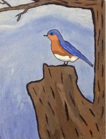
Bird
This was my complementary color piece of an eastern bluebird. I had a picture a reference but I want to put my own spin on it and make it look like a cartoon. In this piece Lines are very important, mainly the different sizes of the lines and for every thing to have a black outline like cartoons. I didn't do to much with the colors and tried to keep them some what flat. There is a little bit of shadows but I tried to keep things simple design and color wise. Overall I feel the picture is ok.
Saturday, November 15, 2014
Color wheel
My color wheel was a weird piece to work on because I didn't know exactly what to do at first so I worked heavily on the design of it. I think the design is the main thing about the piece. I wanted to create movement and I did this with the different sizes of the circles. I also wanted to use circles in the design because all of it is in a giant circle. Colors are also important in this piece, the overall layout of them make the piece look interesting. The contrast with the black background also make the colors pop a little more and bring your attention to the piece. I wish I had experimented more with this piece but overall I do like the piece and it is one of my favorites of the year. So I am happy with it and don't feel like it really needs any changes.
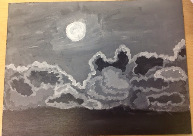
Midnight sky
This was a monochromatic painting of the night sky and my first painting with my golden open paints. This one did out turn out how I wanted it to for different reasons. It needs more values, I didn't do well with the lines either they are to big. The values and lighting are off and I wish it blended more together. I did't really like this piece and it is one of the ones i would go back and fix.
Labels:
art,
black and white,
monochromatic,
night,
painting,
sky,
Tcc
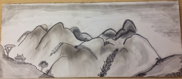
Ink wash with Smoke
This was inspired by traditional Japanese ink paintings. I have studied Japanese in high school and learned about their culture even getting the chance to do some calligraphy. When I first add the smoke to the board it looked like mountains and reminded me of the traditional ink painting and I decided to go on that road for my piece. I had never ink washed before so it was an experiment and learning experience for me. The reason for the painting is for personal reasons, experimenting with a new technique and trying to learn the style. I wanted to keep the painting monochromatic so the absence of color is important. Line was very important in Japanese ink curves are used a lot and placement of lines is important. Balance was another of my concerns I didn't want any area feeling too white or dark. I tried to use proportion on the trees and building but i don't think it work as well as it could of. Overall though I am happy with the piece and it is one of my favorites of the year.
Subscribe to:
Posts (Atom)

